Brenda McManus
Assistant Professor
Pace University-NYC
Adults, Post-Secondary
Teacher/Educator, Curriculum Developer, Parent, Researcher, General User
Arts
:
Brenda McManus, Assistant Professor of Graphic Design in the Art Department at Pace University–NYC. Brenda’s research encompasses typography, integrating antiquated and contemporary technology and methods of making and collaborative design processes.
Brenda received her MS and MFA from Pratt Institute’s Graduate Communication Design Program and has experience in design research, design management, art direction, design writing and a passion for typography.
McManus is the co-author of George Giusti: The Idea is the Heart of the Matter. Her work has been included in Graphic Design Solutions, 4th Ed, Typographic Design: Form and Communication, 6th edition, Color Management for Logos and Color Management: A Comprehensive Guide for Graphic Designers. McManus’ work has also been recognized by the AIGA, IDA, TDC, Art Directors Club, FPO Awards, Creativity, UCDA as well as Graphis, Communication Arts, Print and How magazines.
Brenda McManus's collections
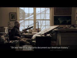
Stamp Design: Micro-Narratives
<p>The postage stamp has a long and rich history within our visual culture. It is a carefully crafted micro-narrative, which often exhibits everyday representations or the spirit of a nation. A good micro-narrative can have a substantial impact in a quick timeframe. They often come from our shared culture – they are parts of stories we communicate, that mark our achievements, struggles, and understanding of our collective culture. They are concise and lead us quickly into making better sense of the world we are in and designing for. </p>
<p>The postage stamp in its limited real estate, is a wonderful study of a carefully crafted micro-narrative. It can build a shared sense of national belonging amongst humans or a sense of tribalism through national identity. They are composed of three essential pieces of information in their design: subject, stamp value, and country of origin. The reference of the country provides context for the subject, which often reflects the country’s national and cultural identity.</p>
<p>This collection serves as a visual aid to expose and explore the design principles and techniques necessary to communicate a concise message within a restricted space. </p>
<p>______________________________________________________________________________<br /><strong>CONSIDERATIONS: use of visual components in a formal, conceptual, and systematic method</strong></p>
<p><strong>TYPOGRAPHIC<br /></strong>The design and arrangement, or appearance of typeset matter. </p>
<p>+ Type as a system and vehicle for communication.
</p>
<p>+ Type used as image, type as form, typographic color, typographic structure, typographic systems <br /> and hierarchy, active white space as punctuation, tempo, and rhythm. </p>
<p><strong>IMAGE<br /></strong>A tangible or visible representation and/or a vivid or graphic representation or description.</p>
<p>+ Images used as a vehicle for communication and storytelling.
</p>
<p>+ Photographs, illustrations, and visual representations like icons, indexes, and symbols. Images <br /> used as type,
images used as form, images used as color, and images used as structure. </p>
<p>+ The Hierarchy of images, i.e. alpha, beta, infra.</p>
<p><strong>FORM</strong> <br />The shape and structure of something as distinguished from its material. Geometric and organic form, graphic simplification, patterns, textures, abstractions, reductions. </p>
<p>+ Form used as type, form used as image, form used as color, and form used as structure. </p>
<p>+ Form/counter investigations, navigation and direction, active white space. </p>
<p><strong>COLOR<br /></strong>A phenomenon of light or visual perception that enables one to differentiate otherwise identical objects. </p>
<p>+ Color can be used in both a functional and symbolic role.</p>
<p><strong>STRUCTURE<br /></strong>Something arranged in a definite pattern of organization. Grid systems, visual organizations, and compositions. </p>
<p>+ Structure used as type, structure used as image, structure used as form, and structure used <br /> as color.
</p>
<p><strong>CONNECTIONS<br /></strong>Formal (syntax) and conceptual (semantics) connections.</p>
<p><strong>CONTENT<br /></strong>Information to be communicated or “story being told.” Thematic cultural, social, and historical reflection. Conceptual story, metaphor, or message. </p>
<p>______________________________________________________________________________<br /><strong>VOCABULARY</strong></p>
<p><strong>Semiotics</strong> - se.mi.ot.ics: a general philosophical theory of signs and symbols that deals primarily with their function in both artificially constructed and natural languages and comprises syntactic, semantics, and pragmatics.</p>
<p>• Semiotic theory is a branch of linguistics that has become a useful tool in two-dimensional design for understanding the relationships between the viewer/user, the form that conveys a message, and the message’s meaning.</p>
<p><strong>Syntactics</strong> – syn.tac.tics: A branch of semiotics that deals with the formal relationship between signs or expressions in abstraction from their signification and their interpreters.</p>
<p>• Syntactic refers to the formal relationship among elements in a composition or among related forms. When analyzing a form for its syntactic qualities, you might ask yourself: Are all the parts of the form arranged to appear unified?</p>
<p><strong>Semantics</strong> – se.man.tics: a branch of semiotics dealing with the relationship between signs and what they refer to and including theories of denotation, extension, naming, and truth: the meaning or relationship on meaning of a sign or set of signs.</p>
<p>• Semantic refers to the relationship between form and its meaning. When analyzing a form for semantic qualities, you should ask yourself: Does the form adequately reflect its meaning? Is the meaning singular or multiple, ambiguous or clear? Which of these is more desirable?</p>
<p><strong>Pragmatics</strong> – prag.mat.ics: relating to matters of fact or practical affairs often to the exclusion of intellectual or artistic matters: Practical as opposed to idealistic.</p>
<p>• Pragmatic refers to the relationship between a form and its user. This aspect examines a sign when it is applied. When analyzing a form for its pragmatics, consider these questions: Is the form related to its context? Is it understandable in its context? </p>
<p><em>• Excerpts from Introduction to Two-Dimensional Design: Understanding Form and Function by John Bowers, pg. 22</em> </p>
<p>______________________________________________________________________________<br /><strong>Brenda McManus<br /></strong><a href="https://www.pace.edu/dyson/sections/meet-the-faculty/faculty-profile/bmcmanus" target="_blank">Assistant Professor</a> | Art Department | Pace University-NYC </p>
<p><a href="http://www.brednation.com/about-1">Co-Founder<br /></a>BRED | a collaborative design lab<br /><a href="http://www.brednation.com">www.brednation.com<br /></a>Instagram: bred_letterpress</p>
<p></p>
<p></p>
 Brenda McManus
82
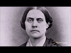
Lessons in the Language of the Suffrage Movement
<p>__________________________________________________________________________________________________</p>
<p>19th Amendment: </p>
<p><strong>Women’s Right to Vote</strong></p>
<p><em>Passed by Congress June 4, 1919. Ratified August 18, 1920</em></p>
<p>The right of citizens of the United States to vote shall not be denied or abridged by the United States or by any State on account of sex.</p>
<p>Congress shall have power to enforce this article by appropriate legislation.</p>
<p><br /></p>
<p>__________________________________________________________________________________________________</p>
<p><strong>2020 marks the 100th anniversary of the 19th Amendment. </strong></p>
<p>The suffrage movement of the mid-nineteenth century, recognized today as the first wave of “feminism,” continues to influence and inspire the ongoing struggle for women’s rights. Many of the methods and strategies of our early pioneers serve not only as inspiration, but, as a model for effective communication that is still relevant today. </p>
<p><strong>“Man was given an eye for an ear.” <br /></strong> — Marshall McLuhan, <em>The Medium is the Massage</em></p>
<p>The pioneers of the suffrage understood the power of the visual message. Their use of color, branded collateral, such as badges, banners, ribbons, and the promotion of their political messages, through the traditional means of posters and postcards, drew attention and created a precedent for protesting copied around the world by other political movements, including today. </p>
<p>These pioneering women used simple language and ‘conversations’ in an attempt to educate people about the injustices of the legal system. These messages were often hand generated in a vernacular manner. The poster, in particular, proved informative, accessible, and an effective medium for the dramatization of a specific point of view. </p>
<p>This collection serves as a brief visual research of language and methods of communication of the suffrage. Through a formal and conceptual investigation of hierarchy and composition using the timely messages of the suffrage, students will explore the process and historical method of poster making, the letterpress printing process. </p>
<p><br /></p>
<p>_________________________________________________________________________________________________</p>
<p><strong>DESCRIPTION/PURPOSE:</strong> </p>
<p></p>
<p>Students will explore the vocabulary of the Women’s Voting Rights Movement through a series of typographic letterpressed permutations. Students will identify and explore themes that are different, as well as those that have remained the same for any disenfranchised individuals in the United States. </p>
<p>Each student is to choose one of the quotes provided in the presentation or find a relevant quote of the time. This will serve as the content for the typographic studies. Depending on the students’ concept for the poster, additional research and text may be required. </p>
<p><br /></p>
<p>_________________________________________________________________________________________________</p>
<p><strong>PHASE 1: Typographic Interpretations</strong><br /></p>
<p>Design a poster representing one of the historic statements of the suffrage. Your poster can remind people of the amendment’s original purpose and importance and/or raise awareness about a particular issue related to the amendment. There are plenty of high profile issues in the news now that directly relate this amendment. Your audience is college students.</p>
<p><em>“ All typefaces serve fundamentally the same purpose: to</em><em> communicate. The purpose behind the communication – <br /> for </em><em>example, to inform, to entertain, or to persuade – is expressed,</em><em> in part, by the typeface chosen. As the <br /> communication </em><em>objectives change, so might the typeface.”</em> – Willi Kunz</p>
<p><br /></p>
<p><strong>Typographic Process and Checklist</strong></p>
<p><strong>1</strong> review <strong>content</strong> – reading/understanding.</p>
<p><strong>2</strong> search for inherent <strong>structure/patterns/rhythms </strong>within the text.</p>
<p><strong>3</strong> develop preliminary plans for <strong>hierarchical</strong> structures.</p>
<p><strong>4</strong> <strong>sketches</strong> – create quick but meaningful “road maps” of your thoughts.</p>
<p><strong>5</strong> develop concepts of <strong>“center and support”</strong> configurations. </p>
<p><strong>6</strong> construct <strong>preliminary, secondary & tertiary alignments.</strong></p>
<p><strong>7</strong> form <strong>constellations</strong> that house sub-thoughts within the text (grouping info.).</p>
<p><strong>8 </strong>consider/reconsider overall <strong>composition</strong> while thinking about <strong>“activating the edge.”</strong></p>
<p><strong>9</strong> play against the <strong>viewer’s expectations</strong>.</p>
<p><strong>10</strong> <strong>legibility</strong> (clarity and efficiency in reading) vs. <strong>readability</strong> (pleasure and interest in reading)– Willi Kunz </p>
<p><br /></p>
<p>_________________________________________________________________________________________________</p>
<p><strong>PHASE 2: Type & Image Interpretations</strong></p>
<p><strong>Learning Objectives:</strong></p>
<p>+ Integrate text + image using the four methods described in the book Type, Image, Message by Skolos + Wedell<br />+ Recognize the design opportunities that come with using type as an image</p>
<p><strong><br /></strong></p>
<p><strong>Type, Image, Message by Skolos + Wedell<br /></strong>Separation, Fusion, Fragmentation & Inversion</p>
<p><strong>Separation</strong> – when the type & image operate independently. Reinforce messages. Type spaces & image spaces.</p>
<p><strong>Fusion</strong> – when the type and image blend to form a unit. Type & image connected by perspective—blend 2 plus things that aren’t usually associated. Conceptually connected. Political or poetic statement. Metaphor</p>
<p><strong>Fragmentation</strong> – when the type & image disturb or disrupt each other. Torn, divided, uneven, disparate. Scale, color, complication. Unpredictable, random, animated, energized message.</p>
<p><strong>Inversion </strong>– form of fusion when type & image trade places & the type takes on pictorial properties or the image takes on type qualities. Harmonious. Type as photo, or hyper-realistic. Letters as frames for images.</p>
<p><br /></p>
<p>__________________________________________________________________________________________________<span></span></p>
<p><strong>DELIVERABLES</strong></p>
<p>• Two 14 by 17 inch letterpressed posters. One typographic solution. One type and image solution.<br />• Printed in 2- 3 color<br />• Quote selected must be included (but does not need to be the primary read)</p>
<p><br /></p>
<p>__________________________________________________________________________________________________<br /></p>
<p><strong>Brenda McManus<br /></strong><a href="https://www.pace.edu/dyson/sections/meet-the-faculty/faculty-profile/bmcmanus" target="_blank">Assistant Professor</a> | Art Department | Pace University-NYC </p>
<p><a href="http://www.brednation.com/about-1">Co-Founder
<br /></a>BRED | a collaborative design lab<br /><a href="http://www.brednation.com/">www.brednation.com
<br /></a>Instagram: bred_letterpress</p>
<p><br /></p>
<p> </p>
Brenda McManus
96
